Challenge:
Conduct in-lab usability testing to develop a content strategy that improves the functionality of an existing site.
Key Insight:
Users could not figure out how to complete basic tasks, so I drastically reduced extraneous content, highlighted key functionality, and streamlined flows.
Tools & Methods: Sketch, Axure, Photoshop, Trello, Heuristic Evaluation, Usability Testing, Wireframing, Prototyping, Content Strategy, Information Architecture
client & site background
MANGO Connects coaches users through the process of deepening their personal and professional relationships. Primarily, it does this by providing tools to build email messages and prepare questions for one-on-one conversations. At the time of testing it was a closed system with no ability to connect with other sites or users, although the marketing copy and site design implied that it was a social networking site similar to LinkedIn.
Whiteboarding user tasks and scenarios to be evaluated during testing
Usability evaluation
None of our testers understood the purpose of the site at first, and at the end of the session, most felt frustrated by the experience. Functionality was difficult to find and different from what they expected. Some were intrigued by the primary functions of the site, but would not use it because the experience had been so confusing and time-intensive.
data analysis
The primary usability issue was that the site presented an overwhelming amount of information with no clear hierarchy. Users could not tell what was important or figure out how to complete basic tasks. I recommended drastically reducing extraneous information, highlighting key functionality, and streamlining task flows.
Site design recommendations
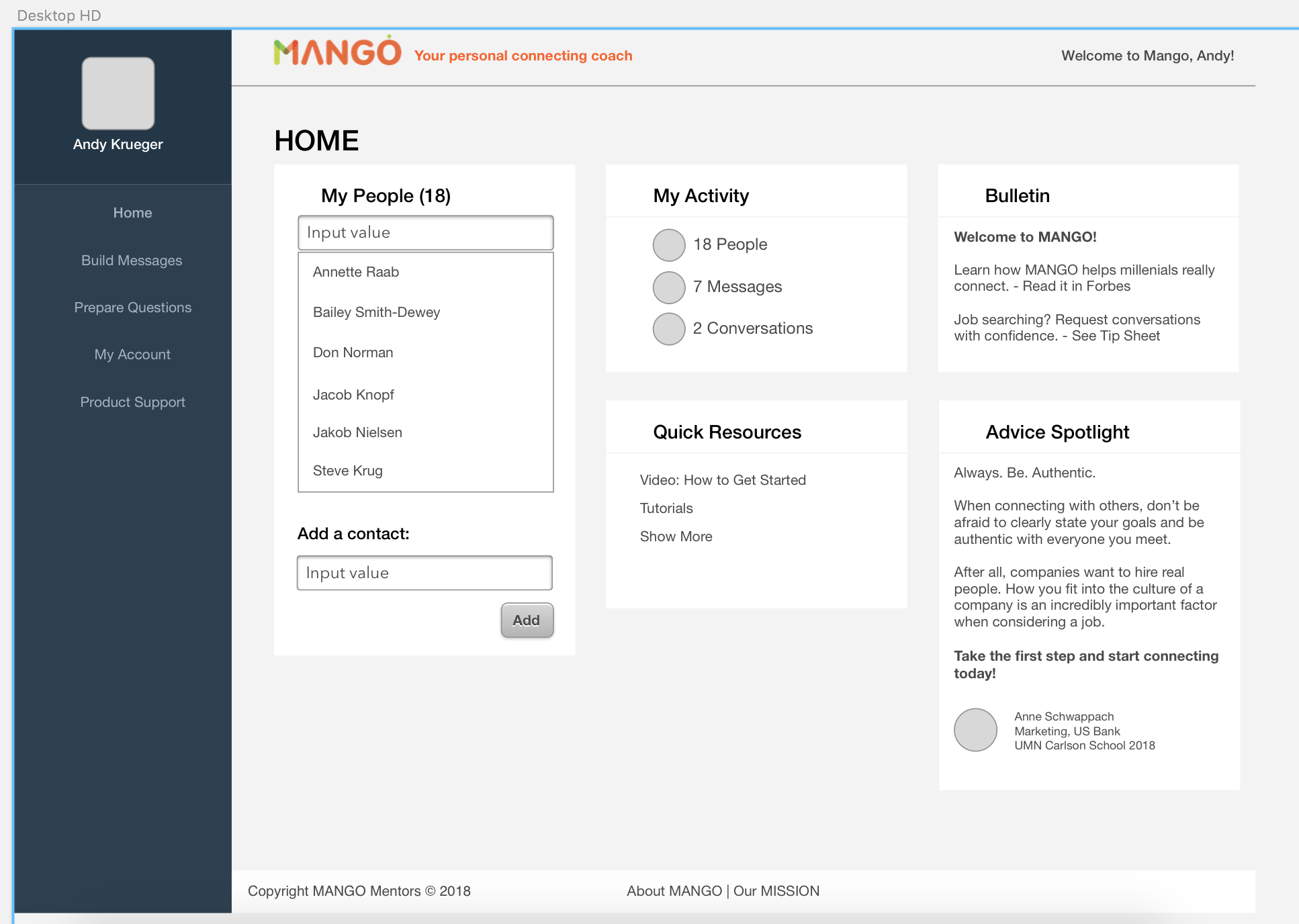
To demonstrate proposed interactivity, I prototyped the main page in Axure. I reorganized the layout to take advantage of western users’ natural “F-shaped” reading pattern, prioritized primary site functions (shown in green) and eliminated elements that users felt to be confusing or useless.


